August 8, 2023 | Jay Stansell
Made for Students: Three Guiding EdTech Design Principles to Look For
Digging a little deeper into the software development process will most likely reveal whether an EdTech program was truly created for learners.
As an educator, I remember defaulting to using certain EdTech programs with my students merely because they felt simple. Looking back, I cannot even tell you if these EdTech programs were backed with efficacy studies or research. I used them because they were straightforward and created positive experiences for myself and the students upon logging in.
Positive experience matters today more than ever. Even the best EdTech products will not impact learning if they’re overly complicated to use. And while research validation is important, today’s tech-savvy students have high expectations of what a digital experience should offer, and they inevitably bring these expectations every time they log into a new learning tool.
As a result, students are one of the best critical evaluators of any digital product. According to The Guardian, a 6-year-old child knows more about technology than some adults do! Therefore, in order to effectively evaluate new EdTech products we should always be putting ourselves in the shoes of the end users: the students. How can we do this? We can rely on three guiding student-centered design principles to help better evaluate EdTech products.
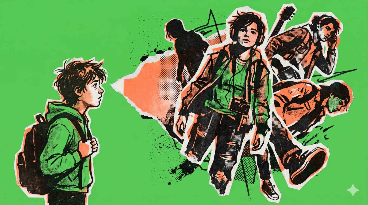
Principle One: Students need EdTech that represents them.
When software was first created it was often very complicated with lots of functions – think of the early Microsoft Word. Alan Cooper argues that this was because many software companies were founded by engineers who themselves made software. In other words, they were thinking of people like themselves, techy people, as the end user. Instead, look for EdTech products that put students first. Does the program look like and feel like something a middle or high school would be attracted to? Has the company included or done user testing with students and teachers while being developed?
For example, at Find Your Grind we regularly test any new feature with students and teachers to ensure it’s truly designed with the end user in mind. Any change to the program also goes through a lengthy discovery process that constantly empathizes with the user by asking: What would a student feel, think, and do?
Principle Two: Today’s students were raised in tech. Make sure the Edtech you choose meets their expectations.
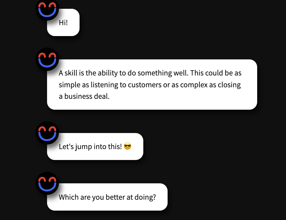
Jakob Nielsen’s, the writer of 10 general principles for interaction design, noticed that because people have already spent so much time using digital products they bring a range of preconceptions when trying new products. Thus, failing to follow easy conventions increases users’ cognitive load and decreases their positive experience. This is why Find Your Grind is modeled after similar technology students use on a daily basis.
For instance, students spend a lot of time on their phones. Because of that, we created interactions that mimic phone messaging. Many of the program’s reflection activities ask questions as ‘text messages’. The program also uses layouts, formats, and conventions which are evident and won’t confuse its users.
Principle Three: Students have a LOT going on. EdTech should anticipate their needs.
Number five on the list of Design Principles of Polite Apps is especially relevant to students: Software should anticipate a user’s needs. In EdTech, students need to quickly log on and access key aspects of their program during a short class period. Moreover, there’s often limited time to complete curriculum assignments, explore new material, and check in on their progress. This is why we’ve gone ahead and completely redesigned the student landing page based on students’ needs.
For instance, students can now quickly access the curriculum (which is now front and center). They’re also easily able to find the four other main parts of the Find Your Grind program: Careers/Explore Content, Portfolio, Notebook, and Favorites. The layout is simple and effective. If they’re lost, there’s a lefthand sidebar to guide and show them where they are.
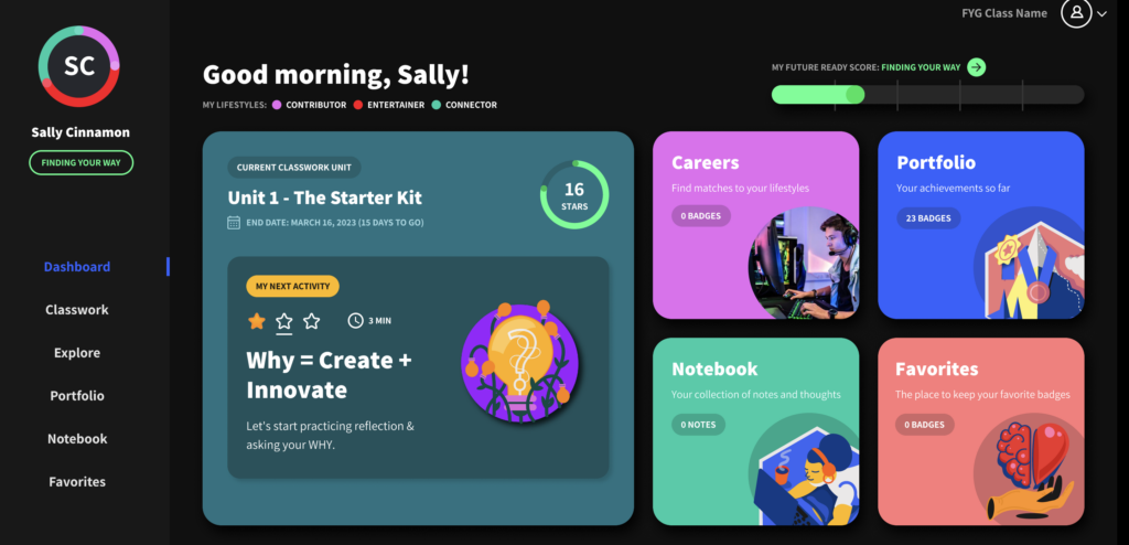
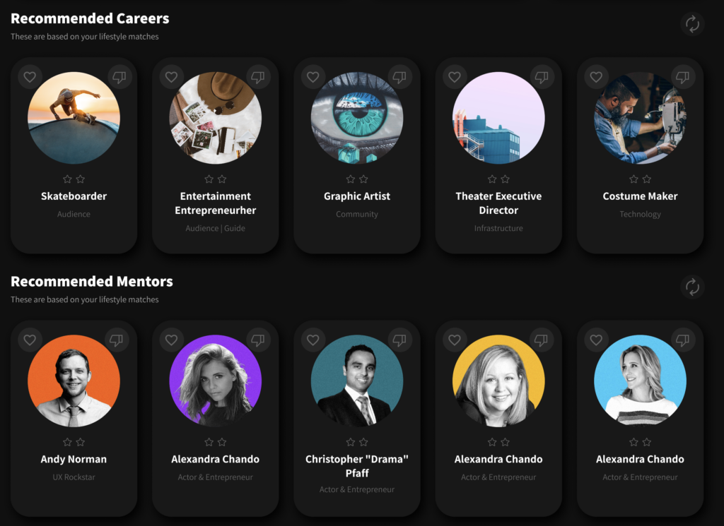
Moreover, Find Your Grind has ensured that students’ personalized careers and recommended mentors are front and center every time they log in by placing these features directly below the key curricular elements. Not only does Find Your Grind anticipate students’ immediate needs, but it also anticipates students’ future need of choosing a career path. Students are encouraged to engage in job exploration every time they log in.
Conclusion: Ask a lot of questions when choosing an EdTech software
If you’re thinking about purchasing a new EdTech program for your school, make sure to ask about the design process and philosophy. Digging a little deeper into their software development process will most likely reveal whether the web-based tool was truly created with educators and students in mind. You’ll also quickly understand if the company has put time and effort into testing new features with the actual audience it was intended for. When viewing the dashboard and other parts of the program continually ask yourself, does this software anticipate my students’ needs? Does this program look and feel like other programs students use? Does this program really represent the generation it’s made for?
If you’d like to hear more about the thoughtful processes behind every Find Your Grind feature or learn more about our student-centric future-ready software, reach out to book a call today.